Pastel colors have long held a cherished spot in the world of design. Their soft, muted tones evoke a sense of calm, nostalgia, and elegance that can transform any space or visual project. As the trend towards minimalism and comfort continues, pastel colors have become increasingly popular, transcending their traditional associations with springtime and baby nurseries to become a staple in modern design. This article delves into the allure of pastel colors, their psychological impact, and practical tips for incorporating them into your home or creative projects.
The Timeless Appeal of Pastel Colors
Subtle Elegance and Versatility
Pastel colors, characterized by low saturation and high brightness, offer a unique blend of subtlety and vibrancy. Unlike bold and bright colors, pastels have a calming effect, making them ideal for creating serene environments. They are versatile and can be used to complement a wide range of design styles, from vintage and shabby chic to modern and minimalist. The ability of pastels to blend seamlessly with other hues makes them a favorite among designers looking to create harmonious and aesthetically pleasing spaces.
Historical Context and Modern Revival
Pastels have a rich history in art and design, dating back to the Rococo period in the 18th century. This era, known for its ornate and decorative style, heavily featured pastel colors to convey a sense of lightness and frivolity. Fast forward to the 21st century, pastels have made a significant comeback, driven by trends in fashion, interior design, and digital media. The resurgence of pastels can be attributed to their association with tranquility and their ability to evoke a sense of nostalgia and comfort in an increasingly fast-paced world.
Popular Pastel Shades and Their Meanings
Each pastel color carries its own unique meaning and psychological impact. For instance, pastel pink is often associated with love and compassion, while pastel blue evokes calmness and serenity. Pastel yellow symbolizes happiness and energy, and pastel green is linked to growth and renewal. Understanding the emotional responses these colors elicit can help in selecting the right pastel shades for your design projects, ensuring that the chosen palette aligns with the desired mood and atmosphere.
Psychological Impact
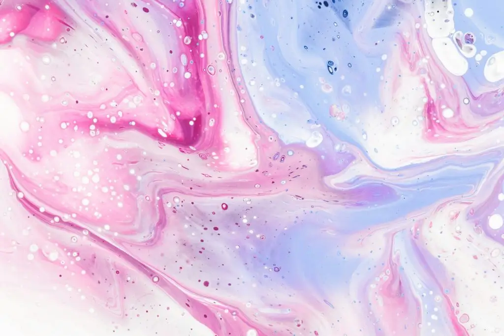
Source: https://unsplash.com/photos/an-abstract-painting-with-pink-and-blue-colors-F56Y7dgrAkc
Creating a Calming Environment
One of the primary reasons pastels are favored in design is their ability to create a calming environment. Studies have shown that colors significantly affect our mood and behavior. Pastel colors, with their soft and muted tones, are known to reduce stress and anxiety, making them perfect for spaces meant for relaxation such as bedrooms, living rooms, and meditation areas. The gentle hues can help create a sanctuary where one can unwind and find peace amidst the chaos of daily life.
Enhancing Focus and Productivity
While pastels are often associated with relaxation, they can also enhance focus and productivity. In workspaces, pastel shades like soft greens and blues can create a balanced environment that is both stimulating and soothing. These colors are less overwhelming than bright primary colors, which can lead to overstimulation and distraction. By incorporating pastels into office decor, you can foster a more conducive atmosphere for concentration and creative thinking.
Encouraging Positive Social Interactions
Colors play a crucial role in social interactions, and pastels are no exception. Their inviting and non-threatening nature makes them ideal for spaces designed for socializing, such as living rooms, dining areas, and cafes. Pastel colors can make people feel more comfortable and open, encouraging positive interactions and conversations. Additionally, pastels are often used in branding and marketing to create a welcoming and friendly image, which can help businesses connect with their audience on a deeper level.
Incorporating Pastel Colors into Interior Design
Choosing the Right Pastel Palette
When incorporating pastels into your interior design, it’s essential to choose the right palette that complements your existing decor and personal style. Start by selecting a primary pastel shade that resonates with you, and then build a color scheme around it. For a cohesive look, consider pairing pastels with neutral tones like white, beige, or gray. This combination can create a balanced and sophisticated aesthetic that is both modern and timeless.
Accentuating with Pastel Accessories
If you’re hesitant to commit to a full pastel makeover, start small by incorporating pastel accessories. Throw pillows, rugs, curtains, and artwork are excellent ways to introduce pastels into your space without overwhelming it. These accents can add a touch of color and softness to your decor, making it feel more inviting and comfortable. Additionally, pastel accessories are easy to swap out, allowing you to update your look with minimal effort.
Pastel Furniture and Statement Pieces
For a bolder approach, consider investing in pastel furniture and statement pieces. A pastel-colored sofa, armchair, or dining table can serve as a focal point in your room, adding a pop of color and personality. When choosing pastel furniture, opt for high-quality materials and timeless designs that will stand the test of time. This way, your pastel pieces can remain stylish and relevant for years to come.
Pastel Colors in Fashion and Beauty
Pastels on the Runway
Pastel colors have made a significant impact on the fashion industry, with designers frequently featuring them in their collections. From pastel pink dresses to mint green suits, these colors are celebrated for their ability to add a fresh and youthful touch to any outfit. Pastels are particularly popular in spring and summer collections, where they complement the lighter fabrics and airy silhouettes of the season. However, they can be adapted for year-round wear by incorporating deeper pastel shades and layering with richer, darker colors.
Incorporating Pastels into Everyday Wear
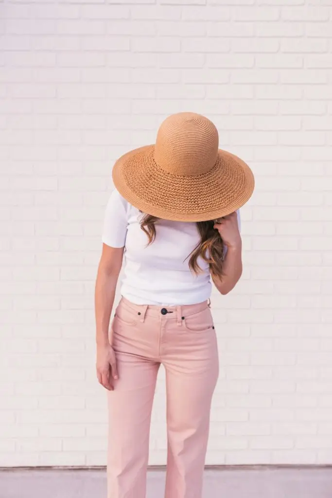
Source: https://unsplash.com/photos/woman-wearing-white-shirt-pink-pants-and-brown-sun-hat-bhLMUIlIhxk
Incorporating pastels into your everyday wardrobe can be a fun and stylish way to refresh your look. Start with pastel basics like tops, skirts, and accessories, and gradually mix them with your existing pieces. For a chic and cohesive outfit, pair pastel colors with neutrals or other complementary pastels. Don’t be afraid to experiment with different combinations to find what works best for you. Pastel-colored shoes, bags, and jewelry can also add a subtle yet impactful touch to your ensemble.
Pastel Makeup and Nail Trends
The beauty industry has also embraced the pastel trend, with pastel makeup and nail products gaining popularity. Soft pinks, lilacs, and peaches are favorite choices for eyeshadows, lipsticks, and blushes, offering a delicate and feminine look. Pastel nail polishes are a great way to experiment with color without committing to a full makeup look. These gentle hues can add a touch of elegance and playfulness to your beauty routine, making them perfect for both everyday wear and special occasions.
The Future of Pastel Colors in Design
Sustainability and Pastels
As the world becomes more conscious of sustainability, the demand for eco-friendly design solutions has increased. Pastel colors, often derived from natural pigments, align well with this trend. Sustainable design practices can incorporate pastels through the use of non-toxic paints, recycled materials, and energy-efficient lighting that highlights these soft hues. By choosing sustainable options, designers can create beautiful pastel-themed spaces that are also kind to the environment.
Technological Innovations and Pastels
Advancements in technology have also influenced the use of pastel colors in design. Digital tools and software allow designers to experiment with pastel palettes more easily and accurately. Augmented reality (AR) and virtual reality (VR) technologies enable clients to visualize pastel-themed spaces before making any physical changes. This innovation not only enhances the design process but also ensures that the final result meets the client’s expectations.
Pastels in Digital and Graphic Design
In the realm of digital and graphic design, pastels continue to be a popular choice for creating visually appealing and user-friendly interfaces. Websites, apps, and marketing materials often utilize pastel colors to convey a sense of approachability and professionalism. The soft hues are easy on the eyes and can enhance the overall user experience. As digital design evolves, pastels are likely to remain a staple, offering a timeless and versatile solution for various applications.
Conclusion
Pastel colors have a unique ability to evoke emotions, create tranquil environments, and enhance the aesthetics of both physical and digital spaces. Their timeless appeal, combined with their versatility and psychological benefits, makes them a valuable tool in the world of design. Whether you’re looking to refresh your home, update your wardrobe, or create a compelling digital presence, pastels offer a soft and sophisticated solution that can transform your vision into reality. Embrace the serenity of pastel colors and discover the endless possibilities they bring to your design projects.
References:
- Smith, A. (2023). The Power of Pastels in Modern Design. Design Trends Journal.
- Johnson, B. (2022). Pastel Colors: History and Revival. Art & Design Quarterly.
- Roberts, C. (2021). Psychology of Color: Understanding Pastels. Color Theory Today.